
又多了一項分析武器老早就想跑這張圖了,終於有空來跑一下那麼就開始。
蒙特卡羅方法
---
随机与蒙特卡罗 第一次人们开始研究蒙特卡罗方法是要评估π。
通过概率论,蒙特卡罗可以用作数值积分法。 例如,

其中p(x)是U(0;1)的概率密度函数。
实践中,蒙特卡罗广泛应用于统计力学,量子物理学,金融衍生产品定价和风险管理。
一个MC示例:期权定价
蒙特卡洛通常用于评估期权价格。
我们不会涉及任何理论推论。 对于欧式看涨期权,其价格可以通过公式给出

其中S为当前基本股票价格,σ为股票波动率,r为利率,T为期权期权,K为行使价,Φ为标准正态随机变量。
股票布朗運動
---
布朗运动、伊藤引理、BS 公式
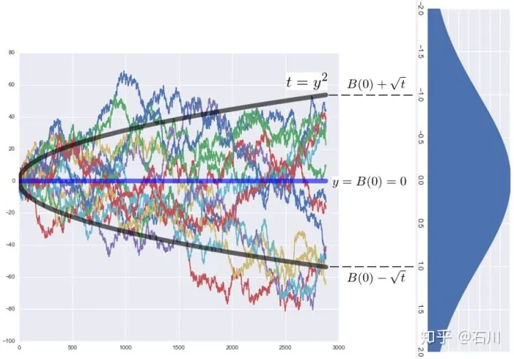 所以到底有沒有可能股市是基於布朗運動呢,上方網址點入,
世界杯球場上的詭異足球軌跡,如何用愛因斯坦的理論來解釋?李永樂老師講布朗運動?
所以到底有沒有可能股市是基於布朗運動呢,上方網址點入,
世界杯球場上的詭異足球軌跡,如何用愛因斯坦的理論來解釋?李永樂老師講布朗運動?
那我假設是有一定規律性的
本周我們介紹股市波動最基本的特性: 對數常態分配(Log-normal Distribution)。有接觸過財務工程的投資朋友可能都聽過這個名詞,因為...
教科書說,股市的漲跌幅,呈現對數常態分配。
這個觀察是奧斯本(Matthew Maury Osborne,1916~2003)發現的。然而,這個現象並不那麼直觀! 我們介紹如下:
簡單模擬蒙特卡羅方法
---
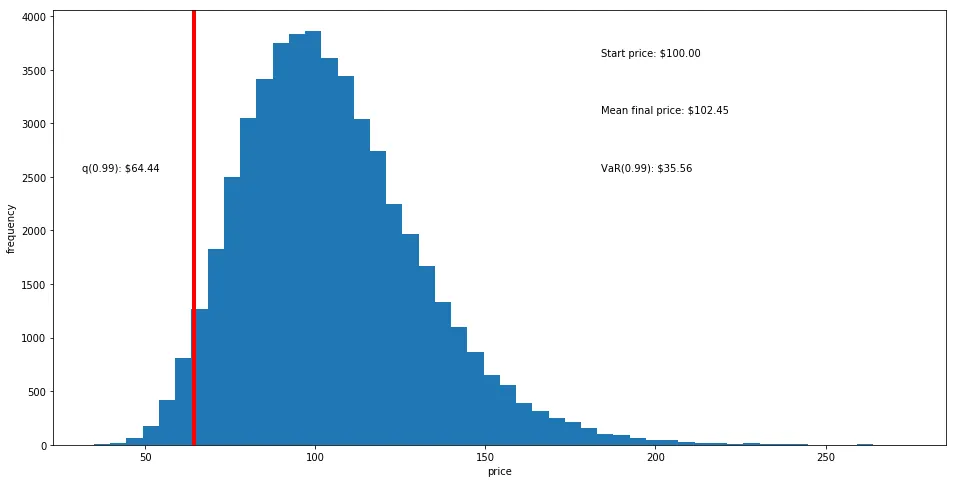
這邊也符合對數常態分配,在99%的信心水平下,統二的股票一年後的價格不會低於64塊ㄏㄏ,風險值有35%,掉那麼快也倒了,或許是我用錯了?參考那網站是好像是用正規常態,我是用對數或許有些關聯。
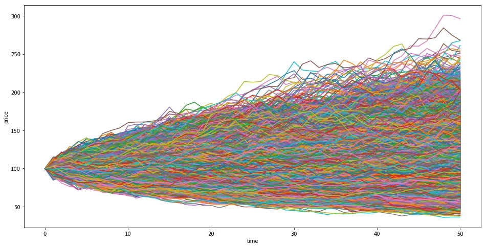 這是模擬五萬次蒙特卡羅(好像沒什麼意義xd。
程式碼
---
import numpy as np
import pandas as pd
import matplotlib.pyplot as plt
import scipy.stats as scs
S0 = 100
r = 0.05
sigma = 0.25
T = 1.0
I = 50000

M = 50
dt = T/M
S = np.zeros((M + 1,I))
S[0] = S0
print (S[0])
for t in range(1,M+1):
    S[t] = S[t-1]*np.exp((r-0.5*sigma**2)*dt+sigma*np.sqrt(dt)*np.random.standard_normal(I))
    print (t)
    print (M+1)


plt.figure(figsize=(16,8))
#define q as the 1% empirical qunatile, this basically means that 99% of the values should fall between here
q = np.percentile(S, 1)
# Plot a line at the 1% quantile result
plt.axvline(x=q, linewidth=4, color='r')
# Starting Price
plt.figtext(0.6, 0.8, s="Start price: $%.2f" %S0 )
# Mean ending price
plt.figtext(0.6, 0.7, "Mean final price: $%.2f" % S.mean())

# Variance of the price (within 99% confidence interval)
plt.figtext(0.6, 0.6, "VaR(0.99): $%.2f" % (S0  - q,))

# Display 1% quantile
plt.figtext(0.15, 0.6, "q(0.99): $%.2f" % q)

plt.hist(S[-1],bins = 50)
plt.xlabel('price')
plt.ylabel('frequency')
plt.show()

plt.figure(figsize=(16,8))
plt.plot(S[:,:],lw = 1.5)
plt.xlabel('time')
plt.ylabel('price')
plt.show()
增加動畫
---
import numpy as np
import pandas as pd
import matplotlib.pyplot as plt
import scipy.stats as scs
from matplotlib import animation

S0 = 100
r = 0.05
sigma = 0.25
T = 1.0
I = 10

M = 50
dt = T/M
S = np.zeros((M + 1,I))
S[0] = S0
print (S[0])
for t in range(1,M+1):
    S[t] = S[t-1]*np.exp((r-0.5*sigma**2)*dt+sigma*np.sqrt(dt)*np.random.standard_normal(I))
    print (t)
    print (M+1)


plt.figure(figsize=(16,8))
#define q as the 1% empirical qunatile, this basically means that 99% of the values should fall between here
q = np.percentile(S, 1)
# Plot a line at the 1% quantile result
plt.axvline(x=q, linewidth=4, color='r')
# Starting Price
plt.figtext(0.6, 0.8, s="Start price: $%.2f" %S0 )
# Mean ending price
plt.figtext(0.6, 0.7, "Mean final price: $%.2f" % S.mean())

# Variance of the price (within 99% confidence interval)
plt.figtext(0.6, 0.6, "VaR(0.99): $%.2f" % (S0  - q,))

# Display 1% quantile
plt.figtext(0.15, 0.6, "q(0.99): $%.2f" % q)

plt.hist(S[-1],bins = 50)
plt.xlabel('price')
plt.ylabel('frequency')
#plt.show()

plt.figure(figsize=(16,8))
fig, ax = plt.subplots()


global test
fig = plt.figure()
ax1 = fig.add_subplot(1,1,1)
#graph_data = open('example.txt','r').read()
#lines = graph_data.split('\n')
xs = []
ys = []

for line in range (0,I ,1):
    xs.append(line)
test =0

def animate(i):
    global test

    if(test < I):

        #ax1.plot(xs[:test], ys[ :test])
        #ax1.clear()
        for y in range  (0,M ,1):

            ax1.plot(S[:test,:])

        test= test +1


ani = animation.FuncAnimation(fig, animate, frames=100, interval=20,
                              blit=False)
#plt.show()
ani.save('/animation.gif', writer='imagemagick', fps=60)
Comments